 I saw a very surprising exhibition the other day, an exhibition of Jay One Ramier, “Jay One” for those who have been following him since his years as a famous street graffiti artist.
The first thing that was surprising is that the exhibition was excellent, certainly not something you see everyday in a gallery world where everyone is just trying to sell what seems to be the popular style of the moment. Another thing, one that hooked me immediately, was the quantity, and they are all good. In this current exhibition there is a large number—two floors of at least forty paintings—of an accomplished style of art that wasn’t quite yet the case in his previous exhibition. The fact that they are so numerous and of such high quality demonstrates a definite mastery of his art.
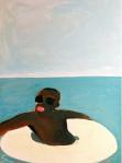
As with any excellent art work, his art demonstrates a certain originality, and this originality is justified. To begin with, and most importantly, it is human, the base of any art hoping to be considered “fine art”. Along with this, Jay One takes advantage of and builds upon his long history as an accomplished and highly appreciated street artist. The graphic nature and inviting colors of his previous street work is put to the service of the portraits we see today, portraits being, by nature human. But the primary subject of his portraits, a reduced image of a black man’s visage—his exagerated colorful red lips juxtaposed with a surrounding portion of his chocolate brown face—go beyond this natural interest. These reduced images (picture Al Jolson) may be viewed as veritable icons in a black history, of which, Jay One naturally belongs: he is black of Guadalupian origin. If we are to refer to the example of Al Jolson in the long history that has helped to make this icon of Jay One so identifiable, one is reminded of Jolson’s blackface and singing style that were used as metaphors for Jewish and black suffering throughout history. Indeed, Jay One’s work is human. Furthermore, as much as this “trademark”, or icon, is being used by Jay One in his present work, it is not being used in gratuitous fashion, that is to say, strictly for marketing identification purposes. In the case of his paintings, that which they express, this trademark effect is simply effective. On the more technical side to this story, we are impressed by a fusion of painting styles: a structured style, with the graphical parts of the human face and other pictorial elements, fused together with a highly dynamic, abstract style. This fusion not only demonstrates a technical mastery of his art, painting, but is, again, naturally pleasing to the viewer.
 Now for the real surprise. As I pointed out above, I was impressed by the quantity of the accomplished work in the exhibition, as well as its coherency, which demonstrated a definite self assurance of style and technique—what all artists strive for. But then, as I moved forward in the gallery, I discovered what I will now refer to as the partner exhibit. I was amazed to see that there was a second line and style of work by Jay One—of the opposing side to the spectrum as it were, one that complements the previous work that I have been speaking about above. In fact, the two styles reinforce one another. This partner work, figurative in style, is not original in and of itself but the reason for it being there in the exhibition is most original. But first, before unveiling the surprising originality in question, a word on what this second line of work looks like. It is a highly purified figurativism, which, by the way, retains a certain graphic quality, a graphic quality being a common denominator in Jay One’s work. The people, when featured in the paintings, represent, inasmuch as they are black, another similarity to the previous paintings, a continuity in terms of subject if you will. The colors as well, a striking palette of pastels in the typical Caribean spirit, share a resemblance—remain highly inviting. But these human figures and these human settings—their purified, stark figurativism—are now, in this line of work, of a most conservative nature. This is the world of the well-to-do black man, of luxury and leisure.
Now the surprise: The images described at the outset of this article express, and effectively so, the more modest world that many a man live in, particularly—I guess we must admit—the black man. Here the paintings are rougher, more rebellious in style, with more heart and soul—certainly so, by way of the particular iconic black visage that is portrayed. The second, or partner work, is beautiful as well, but now in a classic, or more vulgar sense—as you prefer.
The great surprise that I’ve been meaning to get to is this: how two highly different styles were used in the same exhibition, with such effectiveness, and with such purpose.
It effect, it is likely to bring a smile to your face, as I well noticed on others present at the exhibition. One person even cracked a laugh and shared with me the fact that only truly great work brings such wonderful feelings out in him.
I of course, spoke at length with Jay One, before and during the exhibition. There is nothing adolescently political in these works, nothing over emotionally militant here, nothing mean going on in the mind of Jay One. And it shows, beautifully so. A little hardship. A little dreaming. That’s life, according to Jay One.


 From the superhuman efforts of Michelangelo and Leonardo Da Vinci to the super sub-human effortlessness of Jeff Koons or Damien Hirst, everything has, as they say, been done. When you have everything, decadence naturally sets in—to the point that today, for those afflicted by our bling bling culture, serious work—requiring work—is perceived as being the enterprise of a sucker. In this case better the ‘artist’ give the afflicted art fan something that requires no effort like a diamond covered skull, as in the case of Damien Hirst shown here or an inflatable copy of the Hulk, as in the case of Jeff Koons, shown below.
 Left: Another ‘painstaking’ contribution to the fine arts by Jeff Koons.


